- Lead generation landing pages are optimized to direct visitors to a specific action, such as downloading an ebook, or creating a trial account.
- Landing pages for lead generation are minimal, void of any navigational elements, and get straight to the point.
- To optimize a landing page for lead generation, use A/B testing, and experiment with different elements to find the perfect balance.
Generating leads for your agency isn’t throwing spaghetti at the wall and seeing what sticks. It requires strategic targeting, a compelling offer, and a prominent call to action. The best place to bring all these elements together? A high-converting landing page.
But creating a landing page alone won’t guarantee a flood of leads. To maximize your lead sourcing efforts, the landing page has to be well-designed and optimized for conversions. This means crafting a page that grabs visitors’ attention, persuades them to take action, and ultimately converts them into valuable leads.
This article will walk you through what a lead generation landing page is, its design components, and more importantly, how to optimize it for sourcing high-quality leads. Also, I’ll share some landing page examples to inspire you.
What is a landing page for lead generation?
A lead generation landing page is a webpage designed to collect potential clients’ contact information. When someone visits the page, they are expected to take a specific action such as downloading an e-book, signing up for a newsletter, or requesting a demo.
Unlike a homepage or blog pages, a landing page focuses on a single objective: to convert visitors into leads. It serves as a key tool for agencies looking to generate new leads for their products or services.
As part of the content marketing lead generation category, they also play a crucial role: they lower the customer acquisition cost. Instead of redirecting users from your ads to your homepage, a landing page gives them the information they need in a targeted way.
Lead generation landing page design
An effective lead gen landing page design is like a well-oiled machine. It consists of various components that work together to capture visitors’ information. Let’s look at some elements that make up a landing page design.
1. Visually appealing layout
When it comes to capturing visitors’ attention and motivating them to take action, the importance of a visually appealing landing page design cannot be overstated. People are more likely to bounce if your landing page lacks visual appeal, which is especially important in B2C lead generation.
So, it’s crucial to ensure that your page exhibits clear typography, a clean layout, and an overall professional appearance. This captivates visitors and increases your chances of converting them into leads.
2. Valuable offer
According to the law of reciprocity, there’s a human tendency to feel obligated to do something in return when someone does something for you first.
Giving visitors a valuable lead magnet such as a free e-book, whitepaper, or coupon will ensure they reciprocate by providing their contact information. However, you must ensure the resource is relevant, helpful, and easily accessible to your target audience to increase your chances of converting them into leads.
3. Clear and concise headline
Legendary copywriter David Ogilvy once said, “On average, five times as many people read the headlines as read the body copy.” In other words, the headline is often the first thing visitors see when they land on your page. Therefore, it must grab their attention, convey your value proposition, and intrigue them to keep reading.
To drive more conversions, avoid using generic or vague headlines. Instead, use language that speaks directly to your audience’s pain points. For example, instead of “Download our e-book,” a more compelling headline could be “Discover the Secrets to Doubling Your Sales.”
Pro tip: To further captivate your audience, complement your headline with a persuasive subheadline. It’s an opportunity to emphasize the benefits they will gain by taking action.
3. Persuasive copy
The copy on the page should be concise, persuasive, and focused on highlighting the benefits of your offer. Use bullet points and brief paragraphs to make the content easily scannable and understandable.
This is crucial in B2B lead generation because those looking for solutions are usually busy people who don’t want to waste time finding what they are looking for.
4. Prominent call-to-action (CTA)
A call-to-action button guides visitors to the next step, whether it’s signing up for a newsletter, downloading an e-book, or requesting a demo. Make sure the CTA stands out visually and uses actionable words.
5. Visual elements
According to a HubSpot survey, 38.6% of marketers say video is the #1 landing page element that impacts conversion. This highlights the importance of including relevant, eye-catching visuals, such as videos, images, or graphics, to reinforce your offer and persuade visitors to take action.
6. Lead capture form
How do you capture visitors’ information on your landing page? That’s where a lead capture form comes in. It allows visitors to provide their contact information such as name and email address to gain access to your offer.
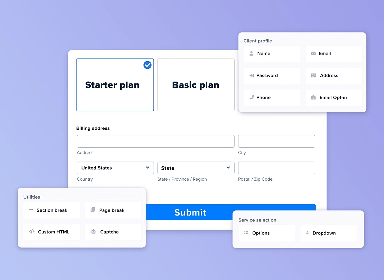
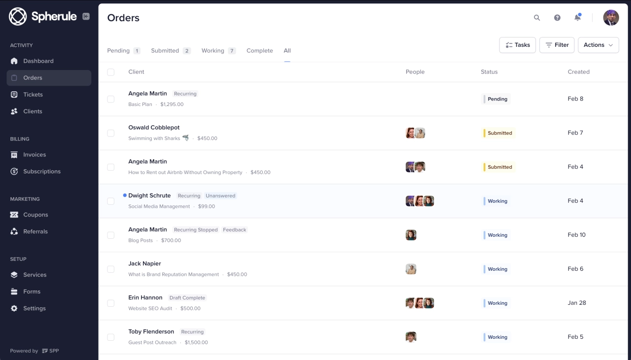
Collect project information, client data, files, and more.
7. Mobile-friendly design
Considering many people search online with their mobile phones, it’s crucial to optimize your landing page for mobile viewing. Ensure your lead gen landing page is responsive and adapts seamlessly to different screen sizes. This will enhance the user experience and encourage potential clients to take action.
How to optimize a landing page for lead generation
The HubSpot survey also shows the average landing page conversion rate across all industries is 5.89%: if you’re getting anything less, optimizing your landing page is an effective way to increase conversions.
Let’s look at some best practices for optimizing a lead generation page.
Experiment with different CTAs (A/B testing)
A/B testing is a method for comparing two or more variations of an element to determine which one performs better. If your landing page gets plenty of traffic but the conversion rate is poor, subtle changes in simple things such as the copy or color of the CTA could significantly impact the click-through rates.
Remove the navbar or other navigational elements
Remember, a landing page’s primary goal is to convert visitors into leads. Eliminating anything that will distract visitors from achieving this goal is a great way to increase conversion rates. One major culprit is the navigation bar.
Removing the navbar and other elements on the landing page helps to keep visitors’ attention solely on your offer and the action to take. Without a navigation bar or links to other pages, visitors are less likely to leave the page. As such, keep your landing page design simple and remove elements that may divert attention.
Add social proof (testimonials, reviews)
How do you convince people to take action on your landing page? Simple: by showing (not telling) them how others got value through your offer. That’s where social proof comes in. It’s a powerful psychological principle that builds trust and credibility.
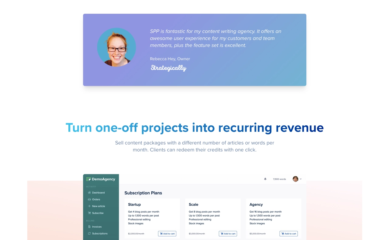
Including relevant testimonials and reviews from satisfied clients that showcase positive experiences with your product or service. This reassures visitors they make a smart choice by converting into a lead.
Make the goal clear (only one per page)
When visitors land on your page, the specific action you want them to take should be obvious. That’s why it’s essential to stick to just one clear goal per landing page to avoid confusion. A cluttered landing page can overwhelm visitors and distract them from the main goal.
Ask only for necessary information (keep the lead gen forms simple)
When creating your lead capture form, keep it simple and only ask for necessary information. Long, complicated landing page forms can deter visitors from completing them. Include fields for their name, email address, and any other relevant details you need to qualify them as potential leads.
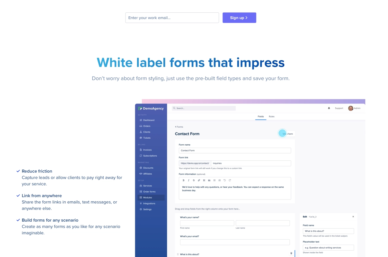
To make things easier, use a powerful white label form builder that allows you to easily ask any information you need. SPP’s form builder has a variety of fields that makes it easy to build the perfect form, from upload fields to option fields—anything you need is available.
5 lead generation landing page examples
We’ve discussed some tips for optimizing your landing page to achieve a higher conversion rate. Now, let’s look at a few lead gen landing page examples that show these tips in action.
1. Hubspot
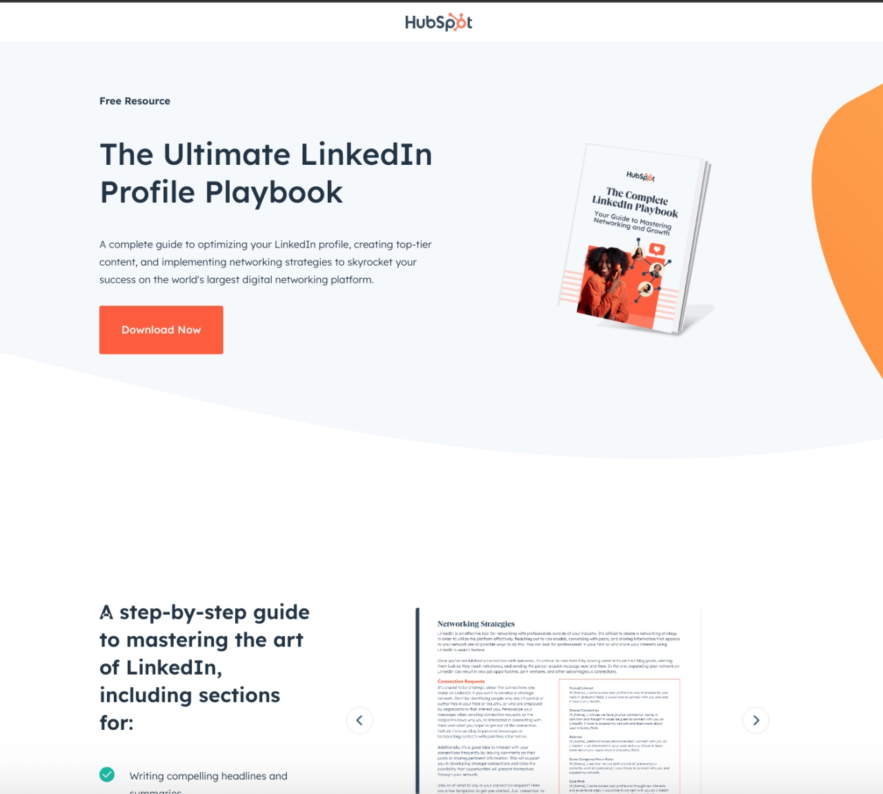
HubSpot is a cloud-based platform that helps businesses with their marketing, sales, and content management needs. To increase brand awareness, grow their email list, and attract potential clients, they give out free e-books, guides, and templates using dedicated landing pages.
What was done well:
The landing page’s clean, minimalist design immediately catches the eye when you visit the page. It has a sub-headline that conveys the value proposition and a CTA that compels visitors to take action.
Further down the page are bullets that highlight the key sections in the e-book. It also features an image that showcases the e-book cover and some of its content, giving visitors a visual representation of what they will receive. Lastly, there’s a FAQ section at the bottom of the page that answers questions visitors may have.
What could be done better:
The headline could be more benefit-oriented.
Displaying success stories or testimonials from LinkedIn users who benefited from the e-book would build trust and drive more signups.
The CTA “Download Now” is slightly misleading because visitors who click through, still have to go through filling out a form in four different steps before they can access the e-book. Adding the form on the initial page allows visitors to provide their details in a single step and enjoy a more seamless experience.
2. Shopify
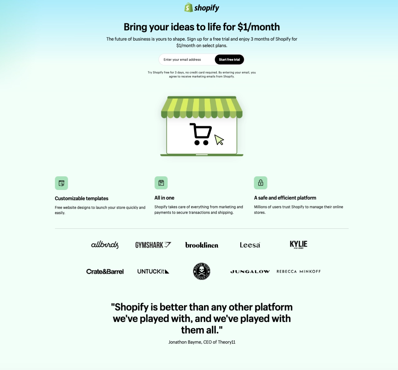
Shopify is a leading e-commerce platform that helps businesses of all sizes create and manage their online stores. It empowers entrepreneurs and established brands alike to take their products online and reach a global audience. And it all starts from a landing page.
What was done well:
Shopify’s landing page does a great job of capturing attention with its simple, eye-catching design. There’s a low barrier to entry, as visitors can start a free trial with only their email address. Also, adding “no credit card required” instantly addresses a major objection that may prevent more people from signing up.
In addition, logos of notable brands using the platform and a CEO testimonial further establish trust and credibility. Got questions? There’s a FAQ section at the bottom of the page that provides answers to common concerns.
What could be done better:
The CTA button is easy to miss. The color could be more contrasting to ensure it stands out on the page.
Including additional images, GIFs, or videos of live Shopify stores could boost landing page conversions and make it more engaging.
3. Backlinko
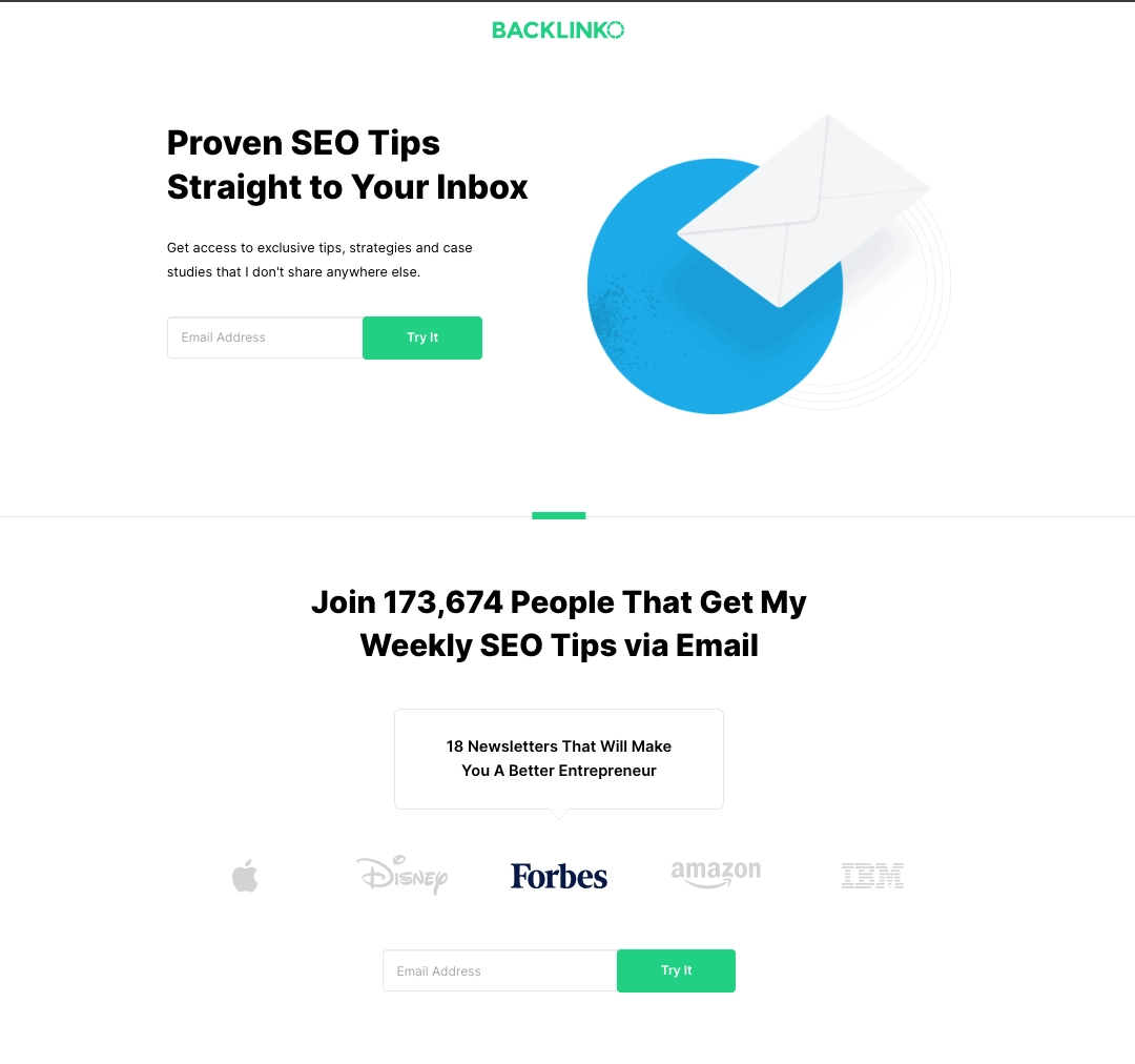
Backlinko is a popular SEO blog and resource hub founded by Brian Dean, an internationally recognized SEO expert. Its primary focus is helping website owners improve search engine rankings through actionable SEO tips and link-building strategies.
What was done well:
The headline/subheadline is benefit-driven as it speaks directly to people looking for SEO tips. Its green CTA button stands out from other elements on the landing page, making it hard to miss. Also, requesting only an email address reduces friction which drives more signups. Lastly, adding logos of well-known brands increases credibility.
What could be done better:
The CTA copy “Try it” is bland and not compelling enough. Changing it to action-oriented copy like “Get my SEO tips” packs more punch and will compel visitors to click.
4. Hellobar
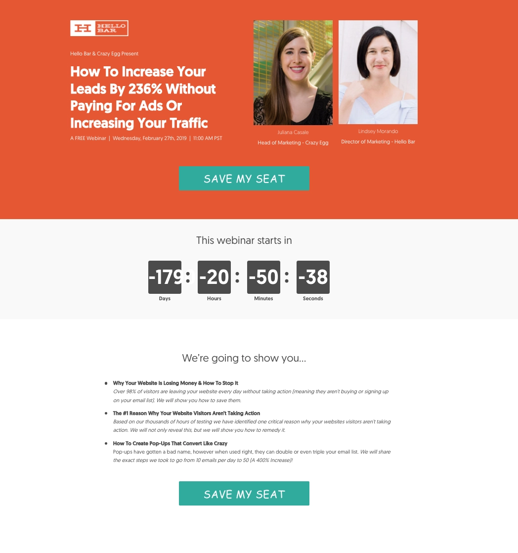
Hellobar is a fantastic tool that allows website owners to add sticky banners to the top or bottom of their web pages. They use these banners to capture email leads, offer free resources, and promote special offers or announcements. Hosting webinars helps them create more awareness about their product.
What was done well:
As an agency owner, the thought of learning how to increase leads without paying for ads is mouthwatering. That’s one benefit of using how-to headlines; grab visitors’ attention and communicate the value they will gain from your offer. In addition, including images of the presenters help to establish credibility.
The countdown timer creates FOMO in visitors’ minds. When they know time is running out, they are more likely to take action. The page also uses bullet-point copy to explain what visitors will gain from attending the webinar. Lastly, there are no links to any external page. This eliminates distractions, allowing visitors to focus on the goal.
What could be done better:
In the mobile version, visitors have to scroll down the page to see the CTA button. This isn’t effective. Placing the CTA button higher on the page so it’s immediately visible allows visitors to take action right away and increase conversions.
5. Zoho
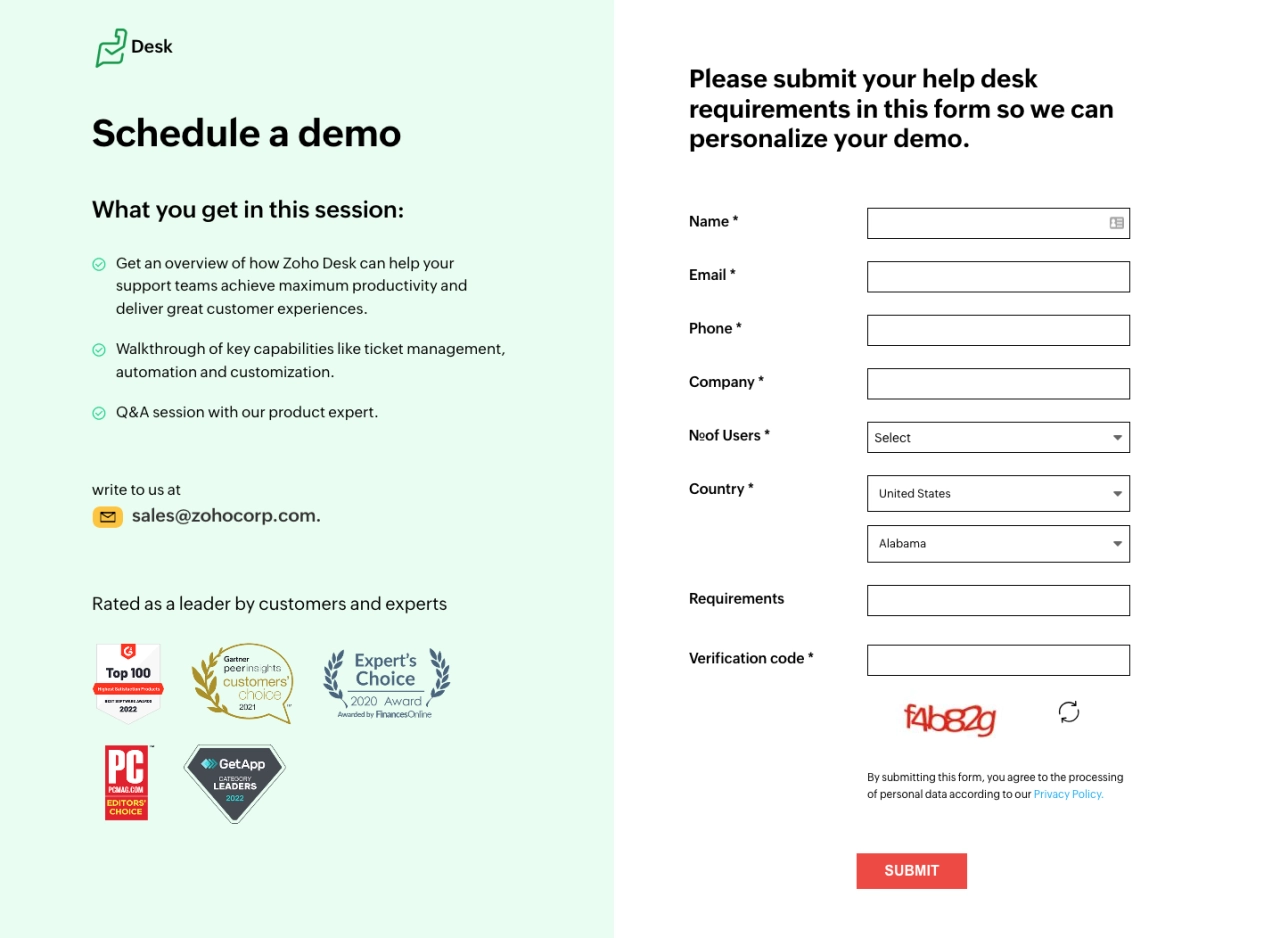
Zoho is a multinational technology company that offers a wide range of cloud-based business software and services. They primarily focus on helping businesses of all sizes improve their productivity and efficiency through various tools and functionalities. They use demo sessions to give business owners an overview of their platform.
What was done well:
The landing page has a simple interface, making it easy for visitors to navigate. It uses bullets to outline what visitors should expect in the demo session. Also, adding achievement badges establishes brand credibility. Moreover, the CTA color is hard to miss as it contrasts with the rest of the page.
What could be done better:
The headline “schedule a demo” doesn’t convey any benefit. Using a benefit-driven headline would boost demo signups.
The landing page has a footer that includes a handful of links off the page. This causes distraction and could reduce conversions.
While a long form may help filter out unqualified leads, it can also deter potential high-quality leads. Visitors may be hesitant to provide detailed information upfront, especially if they are unfamiliar with your brand or have privacy concerns. Instead of asking for all information at once, opt for a shorter form that only requests essential information like name and email.
Using a boring word like “Submit” as the CTA is a no-no. It does a terrible job of convincing people to take action. How about a more actionable copy like “Schedule my demo.”
Frequently asked questions
Do landing pages generate leads?
Yes, landing pages effectively generate leads by capturing visitor information through attention-grabbing headlines, compelling copy, and a persuasive call-to-action. All these help to convert potential customers into valuable leads.
Why is a landing page important for lead generation?
A well-optimized landing page serves as a critical tool in the lead generation process. It’s specifically created to collect visitors’ information and guide them toward becoming valuable leads for your business.
Ready to create a lead generation landing page?
There are many challenges when it comes to lead generation, and there is no such thing as a perfect landing page. However, continuous optimization using the tips and examples outlined in this article will help you increase conversions and generate more high-quality leads for your agency.

