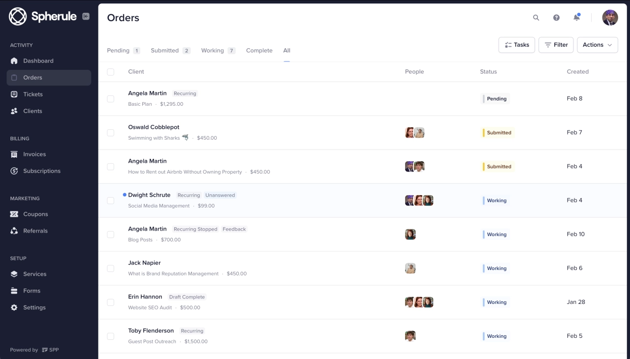
- A customer portal should allow customers to view and update their account information, such as their contact details, billing address, and payment method.
- Customers should be able to view their order history, track their current orders, and receive updates on their delivery status.
- A customer portal should provide customers with an easy way to submit support tickets and access a knowledge base with articles and resources to help them resolve issues on their own.
There’s a plethora of client portal solutions out there, all with different functionality. But some customer portal features are a must-have, and knowing how to implement them effectively is critical for success.
When you decide to implement a customer portal, it’s a decision that will have a huge impact on your business. All your clients, your team, and even external collaborators will use this piece of software. That begs the question: which client portal features do you need and what best practices should you follow to ensure adoption?
Let’s look at the essential features and implementation strategies below.
Understanding this topic involves several interconnected concepts:
- Client Portal
- Client Onboarding
- Custom Domain
- Order Form
- API Integration
- Intake Form
- White-Label Platform
Each of these concepts plays a crucial role in the overall topic.
10 features your client portal needs
These are the features that directly impact adoption rates and portal ROI—skip any of them and you’ll feel it in support tickets or churn.
1. Two-factor authentication
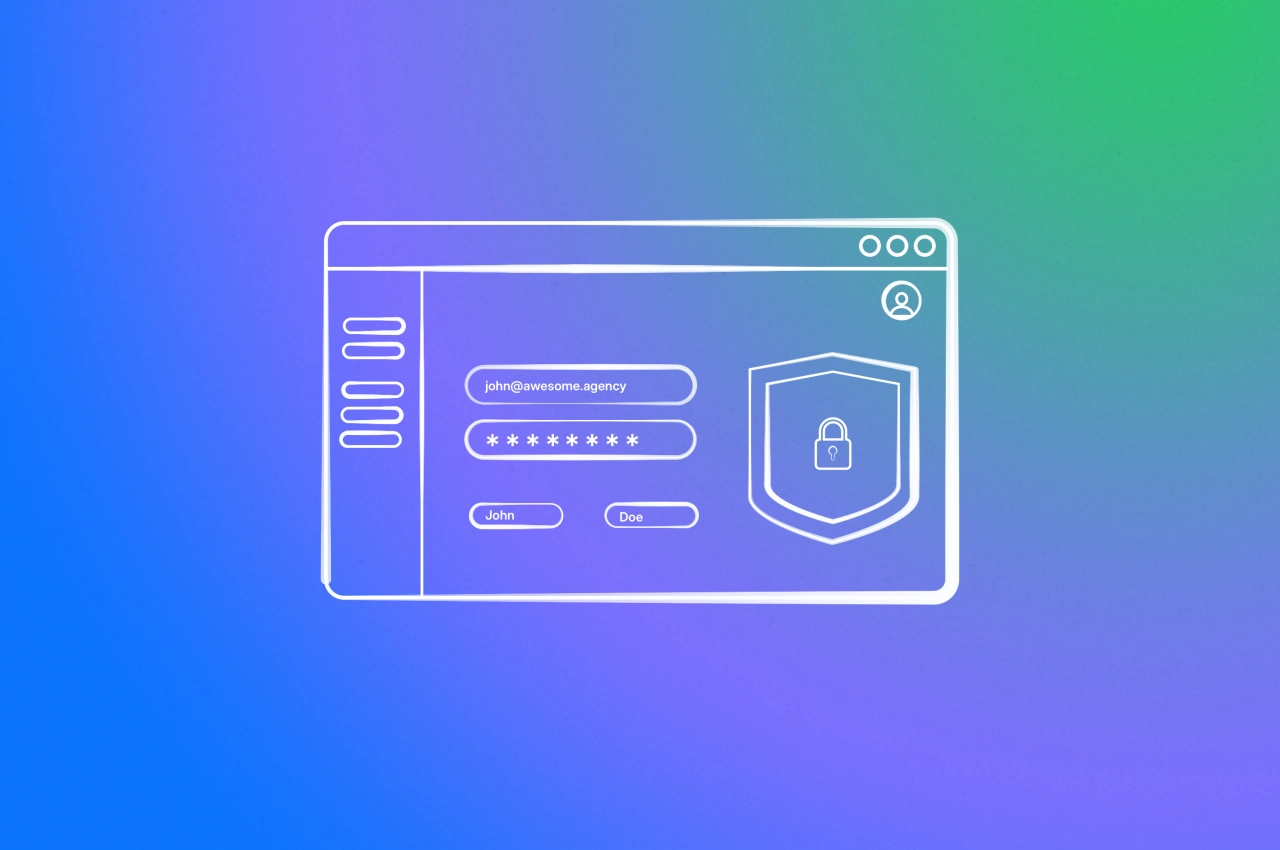
Security is often overlooked when it comes to software, but it is a crucial part of customer portal best practices. After all, you’re dealing with sensitive information your clients expect to be safe. And there are payments, too.
Most client portals allow users to log in via a username (often the email address) and a password. At Service Provider Pro, we’ve gone a step further by providing two-factor authentication.
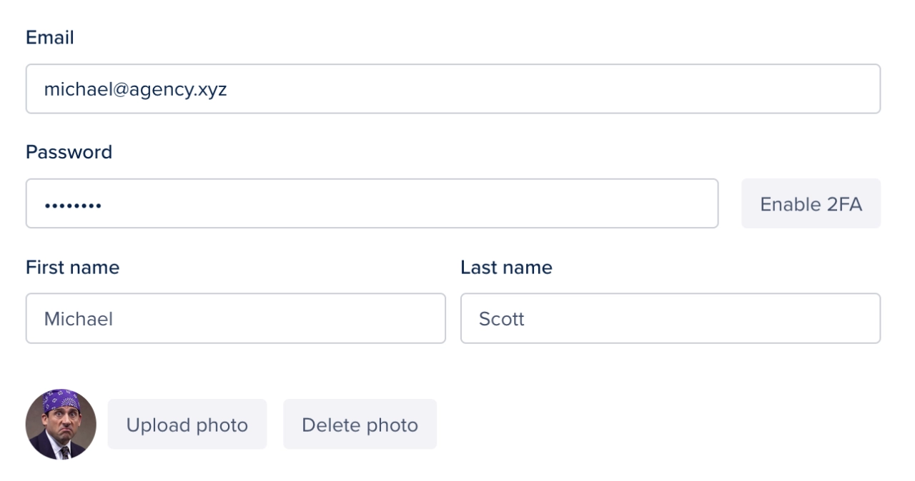
Once enabled, you can scan a code with compatible apps such as Authy, which generate 6-digit codes that expire after 30 seconds. This provides an extra layer to make sure every account is secure.
2. Email & in-app notifications
Staying on top of your workload is crucial when it comes to managing your business, especially those involving multiple parties. If you’re running an agency, you want to know right away when someone needs your input or help.
However, a lot of traditional companies still rely on email notifications—which is fine as long as they can manage their inbox. To provide a seamless experience to customers, there should be at least one other notification option available, for instance in-app notifications.
Those are displayed right inside the portal via a notification center. This is what SPP supports, and on top of that, notifications can also be received via browser push notifications. Keep in mind that everyone in your team will have different preferences when it comes to notifications. It’s best to use a customer portal software that supports many different notification options.
One of the reasons why dedicated client portals are superior to stitched together solutions, such as a client portal running on WordPress, is that those rarely offer notifications.
3. White-label capabilities
Agencies and other companies want everything to be on-brand, from invoices to the client portal software they use. It’s understandable, a coherent style is easier to digest for clients, even if they have to start using new software.
With SPP, you can make your white label portal look like it’s your own software. There are options to set your company name, upload logos, as well as set up your custom domain. With the Enterprise plan, you gain access to our powerful template editor. It allows you to edit client-facing pages, and create custom pages to display almost anything you want.

Even without the template editor, you have powerful branding options at your disposal. For instance, you can load a custom font via the public/custom_scripts.html file, and overwrite the default font used.
4. Reporting features
Which services are selling best, is the customer support team able to stay on top of tickets, and are orders being fulfilled on time? Those are questions anyone running an agency is wondering about. What they shouldn’t have to do is to figure them out by themselves.
A modern portal must have standard reporting features, for instance how much revenue was generated in a certain period
5. Integrations & automations
While chances are high that the chosen software fulfills most of your needs, you might need to make use of integrations or build automations for a custom workflow. A good customer portal solution supports this with webhooks, a Zapier integration, or a native API.
The first two you might be able to set up yourself, and build simple automations via Zapier’s drag-and-drop interface.
Dealing with an API requires someone who’s used to build automations with APIs—that comes with its own costs.
Regardless which option you choose, the portal should offer all of them so that you’re set for years to come.
6. Self-service portal features
Customer self-service portal features are a must-have these days. It will take time and effort off your hands by shifting some responsibilities to the customer. For instance: instead of asking you to upgrade a subscription, clients could do that themselves via your portal.
Self-service options can also be educational: embed a knowledge base so your clients know how to use the portal, or record a demo video for onboarding. The idea is to reduce repetitive work as much as possible for your team while keeping the customer experience elevated. And best of all, self-service usually eliminates the need for real-time help via chat or calls.
7. Central file access
Where did that file go? Not a question you want to ask yourself when a customer is looking for a project file they need urgently. Keeping track of files shared across multiple platforms can be a daunting task.
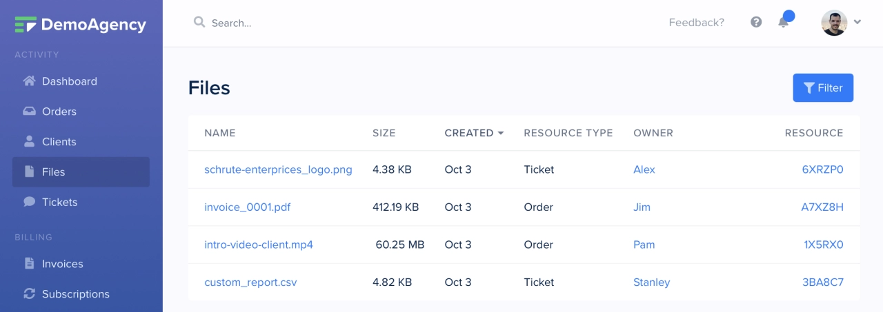
There’s email, Slack, Intercom—but not a central place where everything is gathered. Unless you use a customer portal such as SPP.co of course. Files are always linked to the resource they’ve been shared in, a ticket or an order. Each ticket and each order lists all files neatly in the sidebar. Plus, there’s a file browser that can help you look for documents if you don’t remember where they were shared.
8. Communication options
Similar to how your team prefers different notification settings, they’ll also be delighted if they can communicate in different ways with each other (and clients). While email is still being used to a large degree, most client portal developers would love to see a wide adoption of the internal message system.
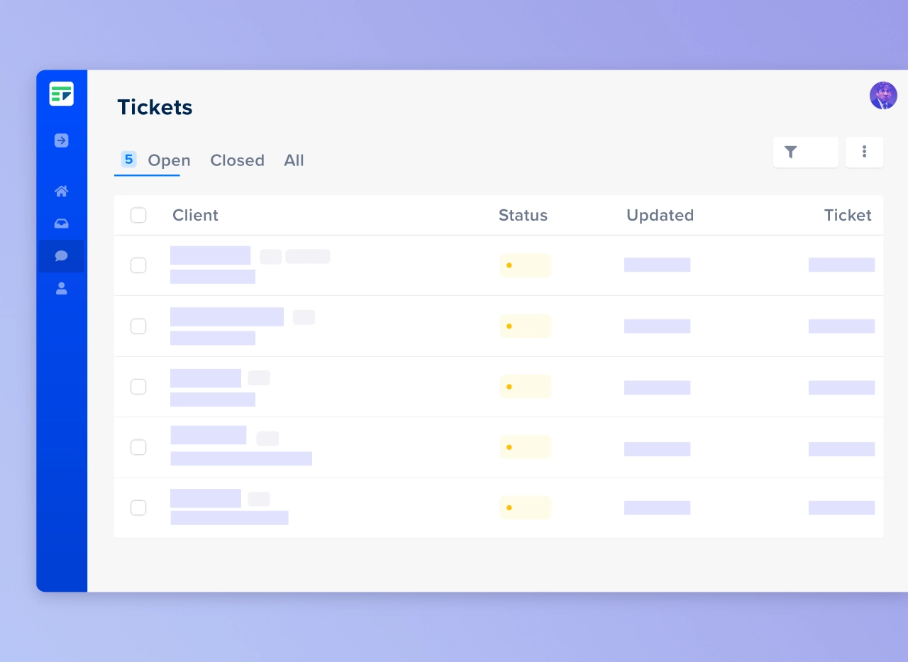
Communicate with leads and clients through our helpdesk.
The reason is simple: it’s much easier to display information in an organized way in a message thread than in an email.
With that said, there are times when you might have to reply via email—and that message should get posted in the relevant thread. SPP takes care of this for you, reply from wherever you want: email, desktop, or mobile.
9. Native invoicing
Billing should be something you never think about. Just set up your preferences and let the system take care of the rest. But some customer portals don’t support native invoicing, causing extra work for your accountants.
SPP creates invoices automatically after an order form has been submitted and paid for. Plus, you can create invoices manually whenever a client requires a custom project.
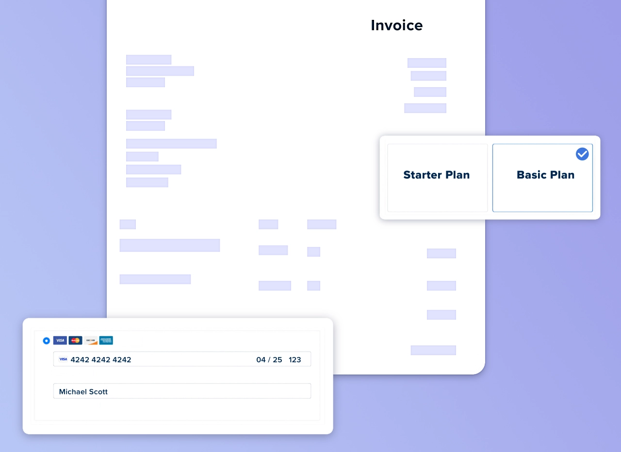
Invoice and collect payments automatically and on time.
Of course, all invoices are saved in the client account. This allows customers to download the invoices whenever they need, and send them to their accountants.
10. Team roles
Admins, managers, contractors—there are many people involved in a business these days. But not all of them should have the same access rights. This is where team roles come in: limit what each role can see and give everyone access to the most relevant information.
Customer portal design principles
The features you choose for your customer portal are critical, but how you implement them determines their effectiveness. Let's explore key design principles that will maximize adoption and satisfaction.
User-centric design approach
Before configuring your portal, take a step back and think about what your customers need. Are they primarily B2B clients working in teams, or individual users? Team-based clients would appreciate collaborative features such as shared access and role-based permissions.
Someone who’s never used a customer portal before will need guidance. This can be in the form of an onboarding call, a dedicated onboarding page, or by making the portal interface exceptionally intuitive. The better the options for customer self-service, the less work your team will need to do.
Optimizing portal layout
SPP’s menu editor allows you to add categories and menu items to the sidebar. However, an effective layout requires moderation—too many options can overwhelm clients and reduce engagement.
According to Hick’s Law, fewer choices lead to better engagement. Instead of placing all services in the sidebar, create custom pages and separate them into logical categories. Even better, use a white label form builder to create smart order forms that display relevant services based on client selections.
Navigation best practices
A well-designed client portal provides intuitive navigation. A common mistake is having confusing navigation because nobody has considered how UI relates to UX. When linking resources in different places (sidebar, navigation bar), ensure there’s a clear logic to the organization.
Keep your CTA buttons consistent across the board, and avoid using colors that don’t match the action. For instance, a button shouldn’t be red unless it's for deleting important information.
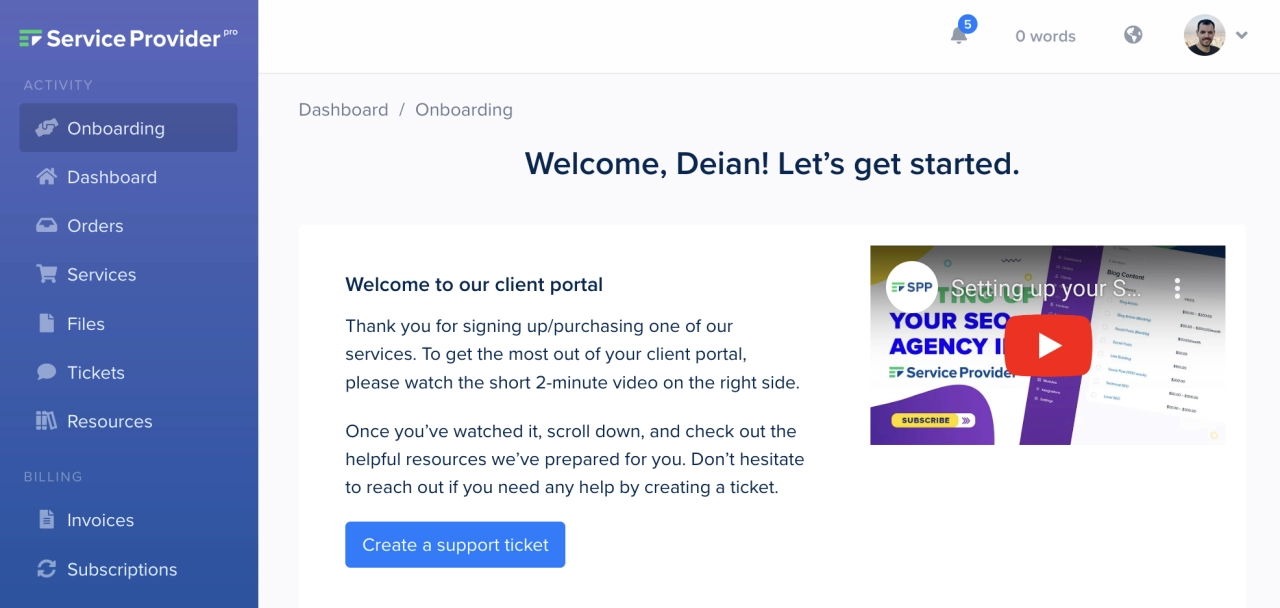
Consider implementing breadcrumbs for custom pages, which help users understand their location and easily navigate back to previous sections without relying on browser controls.
Implementation best practices
Beyond features and design, successful implementation requires strategic planning and thoughtful execution.
Setting up an effective onboarding process
Client onboarding is a crucial investment that requires balance—you want to get clients quickly set up without allocating excessive resources that might not provide ROI based on customer lifetime value.
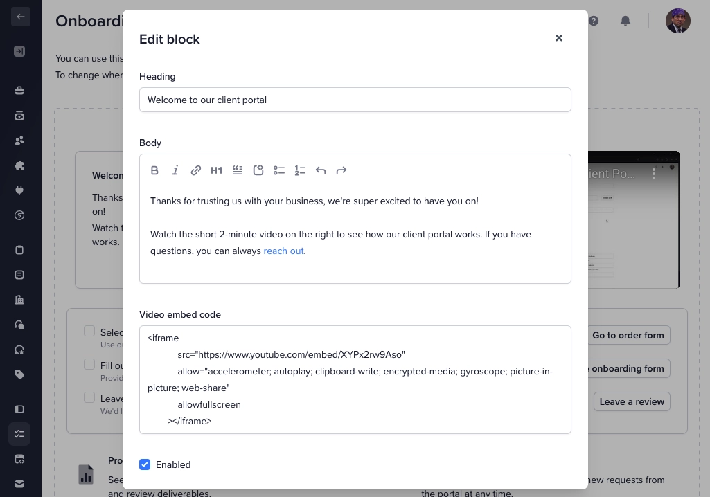
At SPP, we’ve built a customizable onboarding page template that serves as the default landing page when clients log in. It includes sections for welcome videos, blog post links, and client profile information, providing all essential information in one place.
Knowledge base integration
No matter how intuitive your portal, clients will have questions. The most efficient way to handle this is through a knowledge base or FAQ section that allows clients to find answers independently.
You might want to give customers answers they can look up themselves instead of repeatedly addressing the same questions. The best approach is through searchable knowledge base articles that you link to or embed within your portal. Feature the most frequently asked questions prominently near the search functionality.
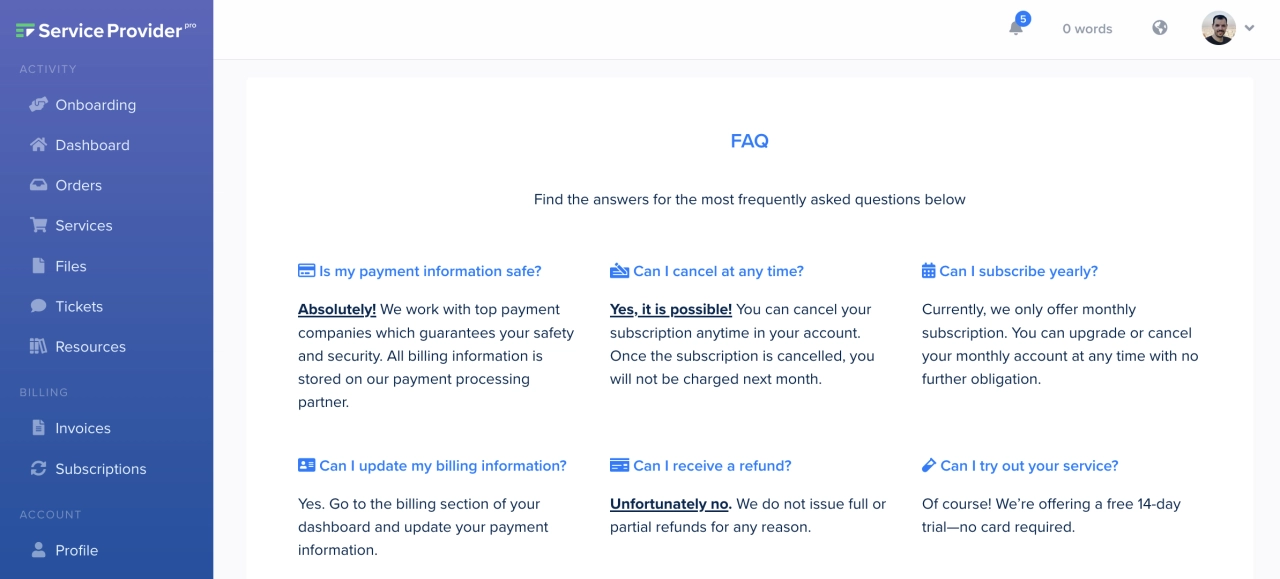
In SPP, you can create a knowledge base using custom pages (utilizing Tailwind components like accordions) or embed an external service via an iFrame.
Adding a ticketing system
Even with comprehensive documentation, clients occasionally need personalized support. While live chat tools like Intercom are available, they require significant resources that may not be justified unless your profit margins are substantial.
A more balanced approach is implementing a ticketing system (like SPP’s helpdesk module). Define your working hours and handle questions systematically during those periods. You can even set up an out-of-office reply that automatically responds outside working hours, setting appropriate expectations for response times.
Personalization strategies
Personalization transforms a generic portal into a tailored experience that increases engagement and satisfaction.
Event-based triggers
A customer who engages with your portal regularly leaves valuable interaction data that can inform personalization. Customer satisfaction often correlates with how personalized the service experience feels.
Consider implementing an event-based system that tracks client behavior. For example, if you’ve created custom service pages, monitor visit patterns to understand the customer journey. You could trigger targeted offers based on cart contents—if a client adds monthly content writing to their cart, suggest complementary social media publishing services.
Simple personalization techniques
If sophisticated tracking seems excessive, simpler personalization is still effective. SPP uses the Twig templating language, allowing you to display conditional messages based on available client data. For instance, show relevant upsell notes to clients based on their current subscriptions.

This approach also works with social proof. By segmenting clients into groups (individuals, agencies, resellers), you can display targeted testimonials that resonate with each segment's specific needs and concerns during the checkout process.
Successful portal examples
Let’s examine how successful businesses implement these features and best practices in their customer portals.
SEO customer portal example
Ranked.ai demonstrates excellent UX principles in their portal implementation. They leverage SPP's onboarding page builder and set it as the default template, greeting clients with all essential information immediately upon login.
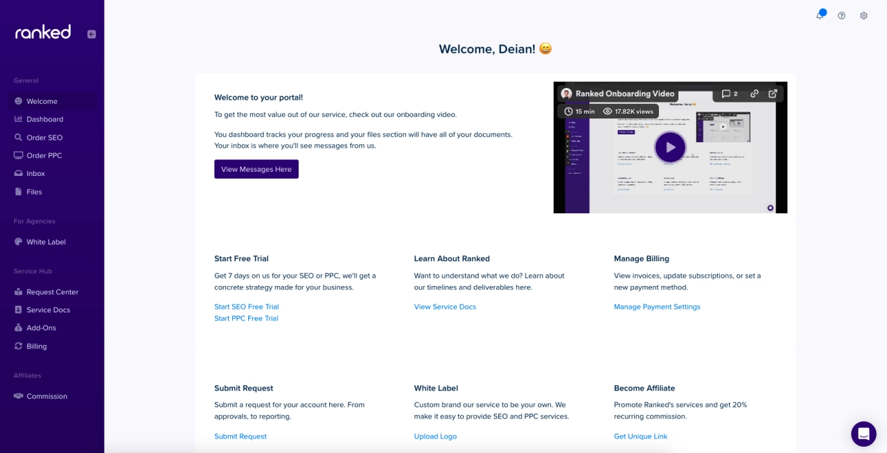
Their approach simplifies the conversion process by making it easy for customers to purchase plans or start trials without requiring calls. They also strategically promote their affiliate program and white-label options, particularly appealing to agencies looking to expand their service offerings.
Social media management portal example
Feedbird has extensively customized their customer portal, reorganizing elements for maximum impact. Their focus on service promotion is evident with four service links strategically placed throughout the interface (navbar, sidebar, and main page).
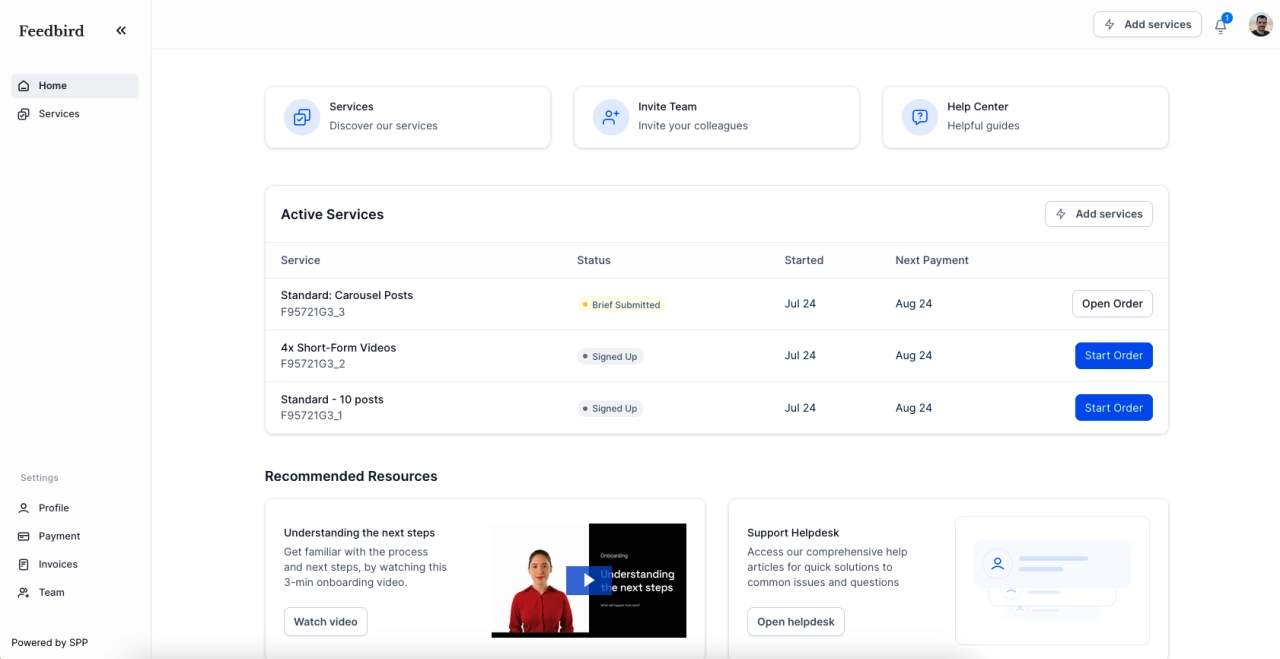
They’ve also integrated client onboarding directly into the main interface, featuring recommended resources under active services. Their video tutorials help clients understand next steps, reducing time spent on repetitive training tasks.
Digital marketing portal example
USA Home Listings has created a distinctive experience by customizing SPP’s design to match their brand aesthetic. Unlike the other examples, they emphasize human touchpoints, offering options to book demos or schedule calls alongside self-service resources.
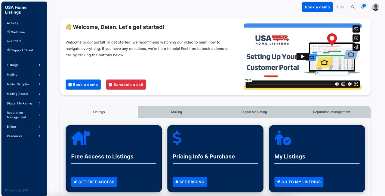
Their sidebar implementation is noteworthy—clicking options reveals sub-menus with multiple service choices. Services are accessible from both the sidebar and main onboarding page, making it exceptionally easy for customers to discover and purchase additional offerings.
Future customer portal trends
As customer expectations evolve, staying ahead of emerging trends ensures your portal remains competitive and effective.
AI and machine learning integration
Artificial intelligence will become increasingly prominent in customer portals, offering more personalized and proactive experiences. Future platforms will likely incorporate AI-powered chatbots that learn user preferences and tailor content accordingly.
Machine learning algorithms could analyze user behavior to identify potential issues before they occur, such as detecting when a client abandons an intake form midway, allowing for proactive intervention.
Examples of AI-driven features include:
predictive maintenance alerts based on usage patterns
personalized recommendations for service upgrades
automated issue resolution through intelligent routing
Automation in service delivery
Automating routine tasks will become standard in customer portals, allowing your team to focus on higher-value activities like strategic planning and relationship building.
Automation can streamline processes like:
scheduling and appointment management
invoice generation and payment processing
routine reporting and analytics
Voice-activated interfaces
As voice assistants continue to transform how we interact with technology, future customer portals will likely incorporate voice-activated interfaces. This evolution will simplify how clients access information, track progress, and receive support.
Imagine clients asking your portal “What’s my current project status?” or “How much will this service cost me?” Voice-activated queries would streamline interactions and make customer portals feel more intuitive and conversational.
Frequently asked questions
What makes a good customer portal?
A good customer portal combines essential features with thoughtful implementation. It enables users to access information they need while being able to engage with the service provider. Key features include self-service options, secure authentication, file management, and intuitive navigation designed with user experience in mind.
What information can a user see in their customer portal?
Depending on the software used, users can access everything from invoices to orders and forms they have submitted. A powerful customer portal can also embed external reports, knowledge base articles, and personalized content based on their service history.
What is the best practice for customer portal design?
Customer portals should follow design guidelines that prioritize ease of use and intuitive navigation. While they should represent your brand, clients shouldn't need extensive training to figure them out. Keep choices limited (following Hick's Law), maintain consistent CTAs, and ensure mobile responsiveness.
Why is two-factor authentication necessary for customer portals?
2FA adds an extra layer of protection against unauthorized access and data breaches, ensuring sensitive client information and payment details remain secure. It’s an essential security feature for any modern client portal.
How can I personalize my customer portal experience?
You can personalize the experience through event-based triggers that respond to client behavior, conditional content display based on service subscriptions, and targeted recommendations. Modern portal software like SPP allows for custom pages and templating to create tailored experiences.
Portal features should improve the customer experience
With the customer portal best practices mentioned, you should be able to invest in a portal for clients that has key features which improve the customer journey, has self-help features, and is user-friendly. In the end, you’ll be able to sell your product or service more easily, have an overview of customer information at all times, and can increase customer retention.
